CARBONTRACK
February 2024 - May 2024

Background
As part of a student project, I was tasked to create an app that empower users to become more environmentally friendly through a more simpler and intuitive approach to tracking carbon footprint. This was a multi-month project that involved user research, prototyping, and more.
THE PROBLEM
RESEARCH
Source: NOAA’s Global Monitoring Laboratory Role
Designer & Researcher (solo project)
Carbon emissions have consistently risen over the years, leaving the younger generation to face the outcomes of our present actions.
“In 2023, global levels of the greenhouse gas rose to 419 parts per million, around 50 percent more than before the Industrial Revolution.”

Collage student could make the biggest impact in lowering carbon emissions due to education, social responsibility, and flexibility yet…
lack the motivation to track and reduce their carbon emission.
don’t know how to reduce their carbon footprint.
are unaware of the concept of carbon footprint and how their everyday actions impact this.
User Interviews
I conducted a total of three in-person interviews and one zoom interview of both target and non-target user demographics to get a better understanding of user needs and features to incorporate into the app to address the needs.

“To keep track of my carbon footprint so future generation can have a better future.”
Empathy Map
Gathering insights from user interviews, I created an empathy map to visualize user behaviors and emphasize with pain points that users have experienced. I categorized user responses from interviews into six different categories of pains, gains, say & do, see, hear, and think & feel. Three main findings from the empathy map:
Prioritize flexibility and convince
View a community building feature as opportunity for app growth.
Build user’s trust of AI and tracking technology
Competitive Analysis
In the research phase of the design process, I looked at both direct and indirect competitor. I created a detailed report of the companies and how users interact with their product. The report contains a breakdown of the companies including the strengths, weakness, and opportunities for growth. This helped me gain insight into the market space and identify opportunities for improvement, innovation, and addressing unmet user needs.

DESIGN
User Persona
- The New York Times
I created two separate personas to represent the different user findings and use cases for the app: one persona as a freshman in college wanting to make friends and the other to get rid of furniture.
Having these two distinct personas allowed me to address the diverse needs and motivations of our target users. The two persona allowed me to better design features and functionalities that cater to both social and transactional interactions, ultimately creating a more versatile and user-friendly app.
*Image of a interviewee’s answer to interview questions


User Flow
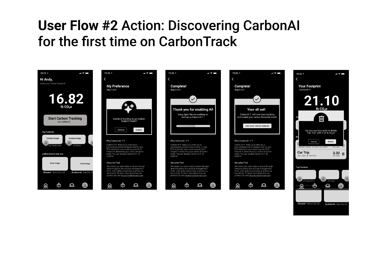
In the design stage, I created a user flow to ensure that my mockup will address pain points, guiding users seamlessly through the app. This user flow highlighted potential bottlenecks and allowed me to optimize the navigation for a smoother user experience. This approach ensured that each step in the process was intuitive and aligned with the design goals.

Mid-fi
Taking insights from the user flow, I created mid-fi wireframes to add more detailed structure and visual hierarchy to the design. These wireframes provided a clearer representation of the user interface, enabling me to fine-tune the placement of key elements and interactions.
Usability Test
Solution
Identify and evaluate the usability of CARBONTRACK.
Conducted usability testing with 5 participants in-person.
User Testing Tasks
Enable AI feature.
Input a recent carbon activity into carbon footprint total.
Locate a local carbon event and join it.
Find furniture through the furniture feature.
Results
In the image above, Flow #4 seemed to universally be the easiest to complete and straightforward too users.
Users are more inclined to scroll through the map in Flow #1 instead of tap on the components to direct them to the location.
Users had trouble understanding the acronym mpg.
Solution
Most pain points that were identified required only minor alteration in order to solve the problem.
Focused on UX writing and minimize the use of acronyms.
Final Outcome
In the transition from mid-fi wireframes to high-fi wireframe, the main focus was to refine key touch points and interactions to ensure its usability. These high-fidelity wireframes represented my entire design process, showcasing detailed elements, accurate typography, and color. User feedback from previous stages was meticulously incorporated to address any lingering issues and enhance overall usability.
SUMMARY
Personal Thoughts
This project highlighted the importance of a structured and iterative design process. I managed my time effectively to conduct thorough research, develop user personas, and create detailed user flows. Moving from mid-fi to high-fi designs, I meticulously refined key touch points and interactions to ensure usability. This experience reinforced my belief in the value of a methodical approach and careful prioritization in delivering successful UX projects. It underscored the importance of staying organized and focused throughout each stage of the design process to achieve the best possible outcome.


